Digital menu board design: the numbers that make a board readable at 6 metres
Digital menu board design as arithmetic, not taste — type size against viewing distance, the contrast floor, how many items fit on one screen, price alignment, when a photo is just noise, and how long a panel should hold.
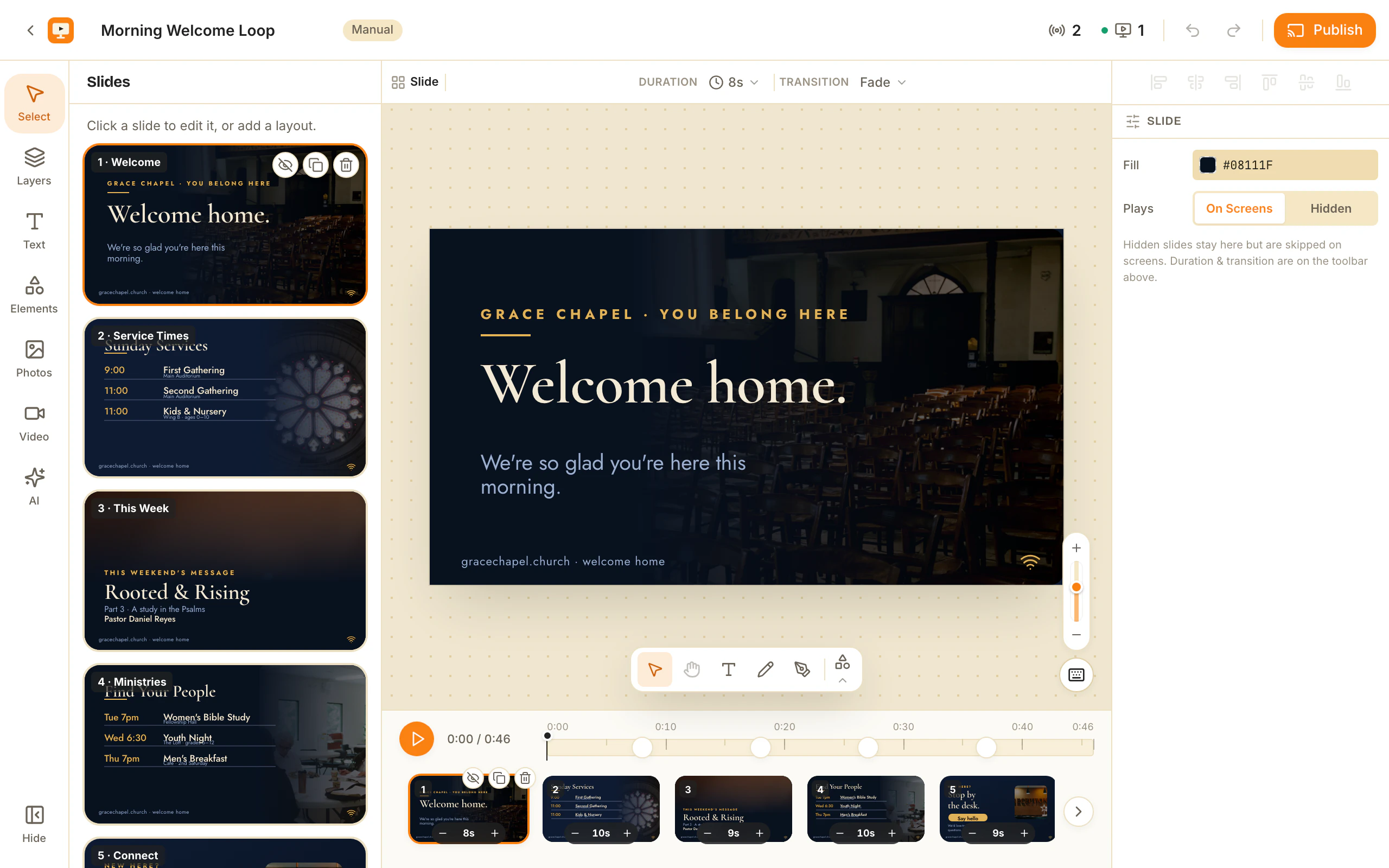
Most digital menu board design advice is about taste — which typeface feels right, whether to use a photograph of the burger. The questions that decide whether the person third in the queue can read your board are arithmetic: how far back they stand, how tall the letters are on the glass, and how much contrast survives a room with a window in it. This is the numbers version.
Measure the distance first. Item count, price size, whether a photo earns its space — all of it falls out of that one figure.
Measure the room before you open the editor
Two measurements, taken in the room rather than estimated from a floor plan.
The furthest read. Measure from the screen to where the last person in a normal queue stands. Use that, not the average — a board designed for the average reader is unreadable for half the queue.
The screen’s height, not its diagonal. Type size scales with height. A 16:9 TV at 43 inches is about 535mm tall, at 55 inches about 685mm, at 65 inches about 809mm. The canvas itself is 1920x1080 for a landscape TV and 1080x1920 for one hung sideways, and the digital signage size guide has the rest of those numbers.
While you are there: most TVs overscan slightly and plenty are mounted a little off-square, so keep everything that matters inside a 5 per cent margin on all four edges. A price that reads perfectly in the editor and is clipped by 12 pixels on the wall is the commonest preventable fault there is.
Type size versus viewing distance
The sign trade’s oldest rule of thumb: about 25mm of capital-letter height for every 3 metres of viewing distance — one inch per ten feet, or roughly 8mm per metre. That is a legibility floor for a glance, not a comfort target, so round up rather than down.
Capital height is roughly 70 per cent of the font size you type. The table converts for you, and gives the size for the item name — the smallest thing a customer must read.
| Furthest read | Cap height needed | 43” screen | 55” screen | 65” screen |
|---|---|---|---|---|
| 3 m (10 ft) | 25 mm | 70 px | 56 px | 48 px |
| 4 m (13 ft) | 33 mm | 95 px | 75 px | 64 px |
| 5 m (16 ft) | 42 mm | 120 px | 95 px | 80 px |
| 6 m (20 ft) | 50 mm | 145 px | 115 px | 95 px |
Pixel figures are for a 1080p canvas. On a 4K canvas, double them.
Two things people get wrong. First, judging the result on a laptop at 60cm, where almost anything is readable — which is why the board fails on the wall. Second, treating the board as one size class. Headings want 1.6 to 2 times the item size; allergen notes and small print are genuinely exempt, because those get read at the counter, not from the queue.
Contrast: 7:1 is the floor, not 4.5:1
The familiar 4.5:1 accessibility figure was written for a screen an arm’s length from your face. A wall-mounted TV read at 4 metres, off-axis, with daylight on the panel, needs more. Use 7:1 as the minimum for item names and 10:1 for prices. Concrete numbers, because “high contrast” is not an instruction:
- Near-white on near-black — #F2F2F2 on #141414 — is about 16:1. Safe default, and why boards tend to run dark rather than light.
- The mid grey people reach for as a secondary text colour, #888888 on dark, is about 5.2:1. Refined in the editor, gone at 4 metres.
- Pure red on black is about 5.25:1 — the commonest mistake on a menu board, because red reads as appetite and nobody checks its luminance. Put red on white, or use it as a fill behind light text.
Weight matters as much as colour: nothing lighter than Medium (500) for item names, Semibold (600) beyond 5 metres. Light and Thin weights lose their strokes to distance and to the sharpening most shop TVs apply out of the box. Text over a photograph needs a scrim, checked against the lightest pixel behind it.
How many items belong on one screen
Once type is that large, item count stops being a preference and becomes division. On a 1080-line screen, take 5 per cent off top and bottom, allow a heading at 1.8 times the item size, and set line pitch at 1.35 times the font size. About 780 lines of usable height remain:
- 3 metres on a 55-inch screen: room for 10, use 7.
- 4 metres on a 55-inch screen: 7.
- 6 metres on a 55-inch screen: 5.
- 6 metres on a 43-inch screen: four, and that is not a mistake.
Five to seven per panel, ten as a hard ceiling. If that sounds like too little menu, the instinct is inherited from print: a printed board carries everything because there is only one of it. A digital board does not — split the menu by course across several panels and let the schedule rotate them, which is why a board is a show rather than a poster (digital menu board for restaurant TVs covers the mechanics).
Group within a panel too: five to seven items under one heading is a list a person can scan, twelve is a wall of text however big the type. The free menu board maker starts you on layouts already built to those counts, across 14 cuisines from pizzeria and sushi to bakery, bar-pub, indian and food-truck.
Prices are a typography problem
The price column is where otherwise decent boards come apart, and every fix is mechanical.
Right-align prices in their own column. Digits stack and the eye scans down a single edge. Never centre a price list — a centred column has no edge to follow, so the reader re-finds the number on every line.
Use tabular lining figures. In a proportional face a 1 is narrower than an 8, so 11.00 and 18.00 do not line up. Tabular figures give every digit the same width. Pick a family that has them before you pick one you like.
Keep the price the same size as the item name, or one step smaller — never larger. People scan for the dish, then the price. A price set larger inverts that order and slows the board down.
Be consistent about decimals. Either every price carries them or none does. Mixing 12 and 12.00 in one column is free to fix and the most visible sloppiness on a board.
Dotted leaders only when the gap exceeds about a quarter of the column width. Below that they are decoration that costs contrast.
Two-price items belong in a table. Regular and large, glass and bottle, half and full are two columns with a header row, not “8/12” jammed onto the item name. A table is a first-class element you draw on the slide and edit cell by cell, so the columns align instead of being faked with spaces.
Photos, and when a photograph is just noise
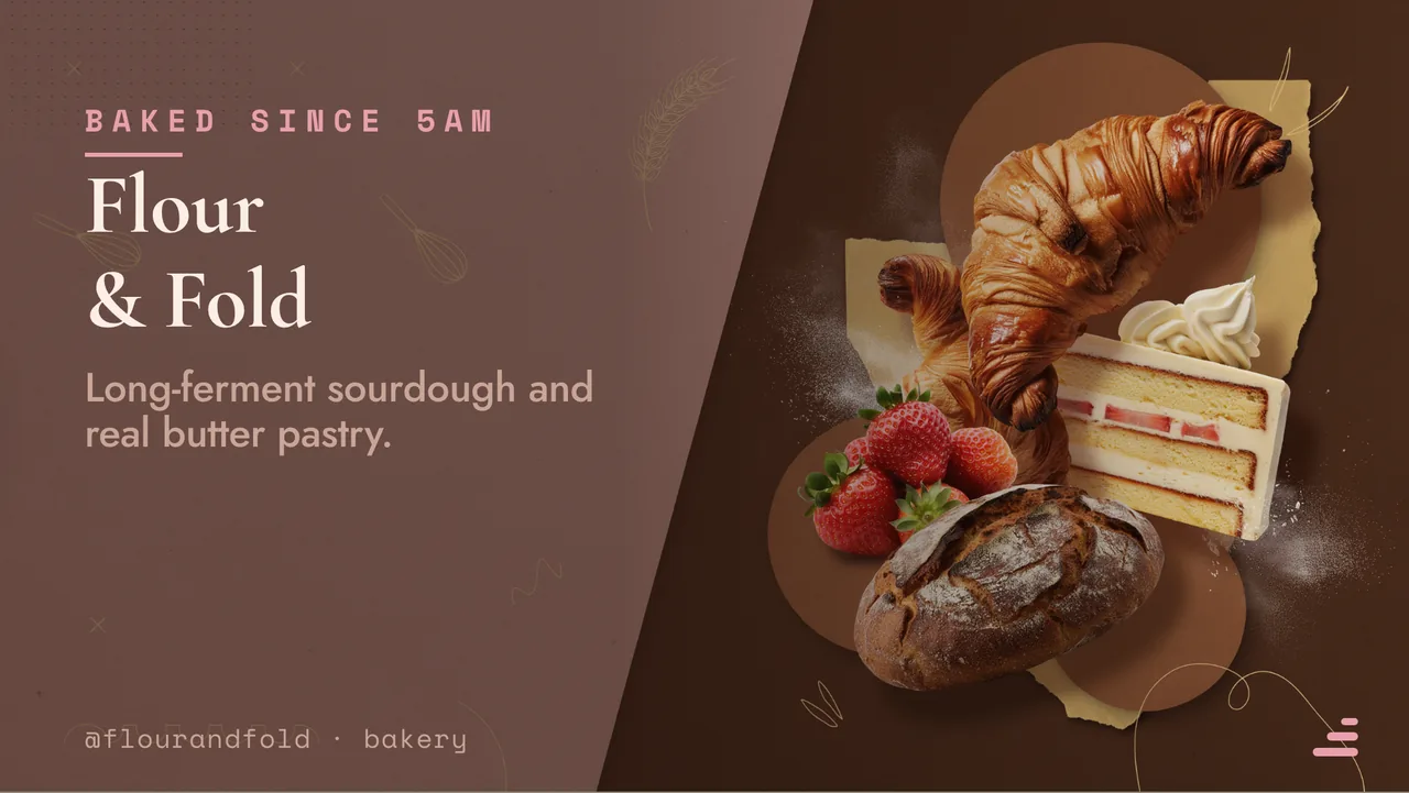
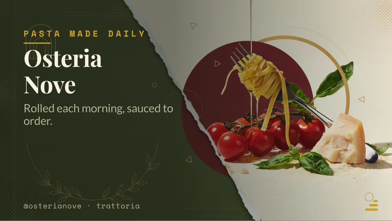
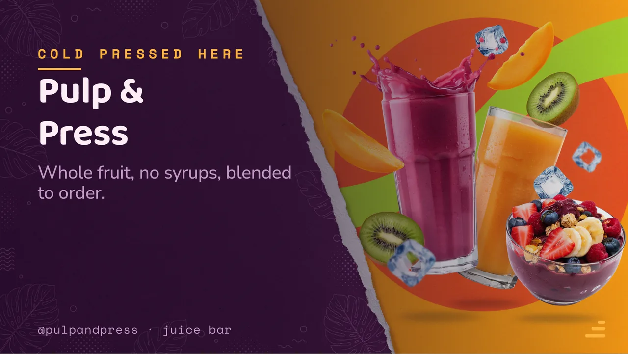
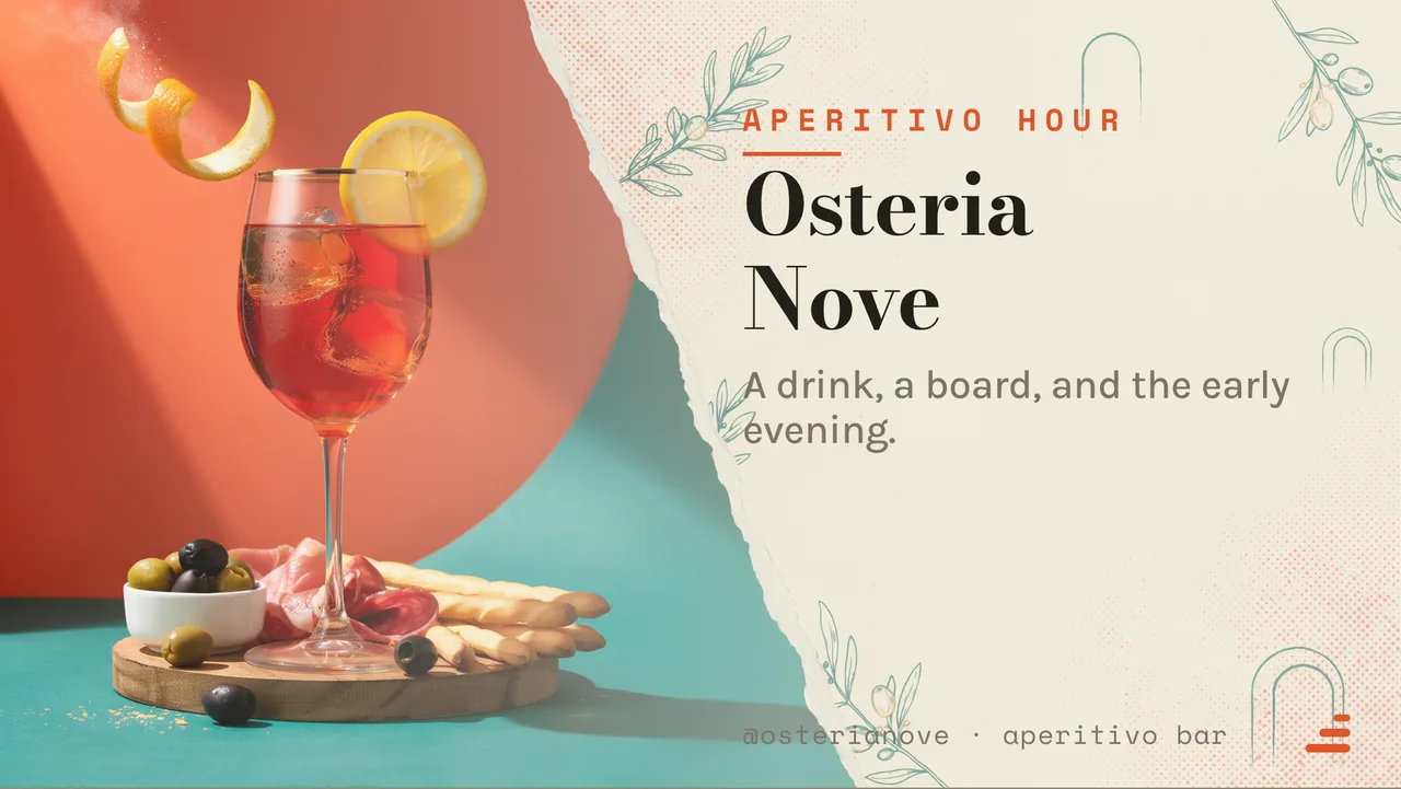
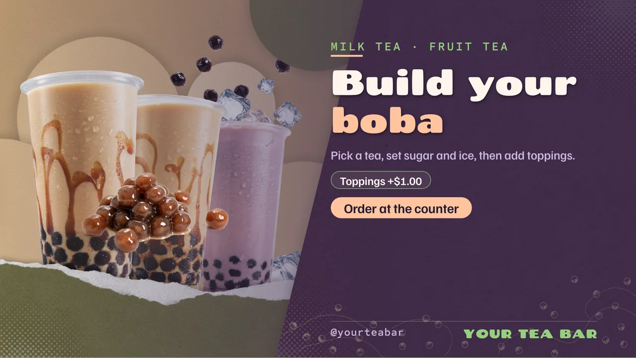
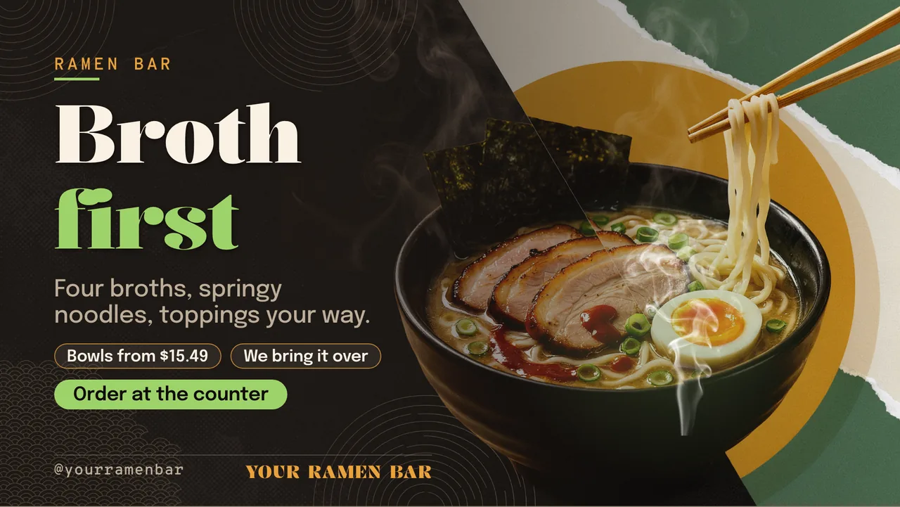
A photograph earns its place only if it is recognisable at the furthest read. Below roughly 15 per cent of screen area, a food photo at 4 metres resolves as a brown rectangle — it eats the space of two menu items and says less than either. So: one photograph per panel, large, of one dish. Not six thumbnails beside six items. Want photographs of everything? That is six panels with a photo each.
Two formats work. A full-bleed background image at low contrast with text on a scrim over it — mood, carrying no information itself. Or a cutout: the dish lifted off its background so it sits on your own colour, which reads far more cleanly at distance than a rectangle of someone else’s tablecloth. One-tap background removal does that lift; the free Pexels library covers the mood shots. Video stays slow and cut-free — hard cuts pull the eye off the prices, which is backwards.
Colour: three, and one of them is the price
A background, a text colour, and one accent. That is the whole palette.
The accent goes on one thing — the price column, or a “today only” flag, or the section headings, but not all three. An accent used everywhere is just a second text colour, and the hierarchy goes with it.
Resist colour-coding categories: six hues for six sections looks organised in the editor and reads as confetti at 5 metres. Separate sections with space and a heading instead. Check any pairing you invent against the contrast floor above — saturated colour behind small text drops you from 16:1 to 4:1 without your noticing.
A brand kit holds those three colours and the type pairing steady across every board and screen, which matters more once there is a second site. If picking three from scratch is the blocker, the templates gallery has finished palettes to remix.
How long each board should hold
Dwell time is arithmetic too: about two seconds for a customer to register that the board changed, plus a little over a second per line they have to read.
- A seven-item menu panel: 10 to 12 seconds.
- A promotional slide with one headline and one price: 6 to 8 seconds.
- The whole loop: under 45 seconds, so someone queuing for 90 seconds sees every panel twice.
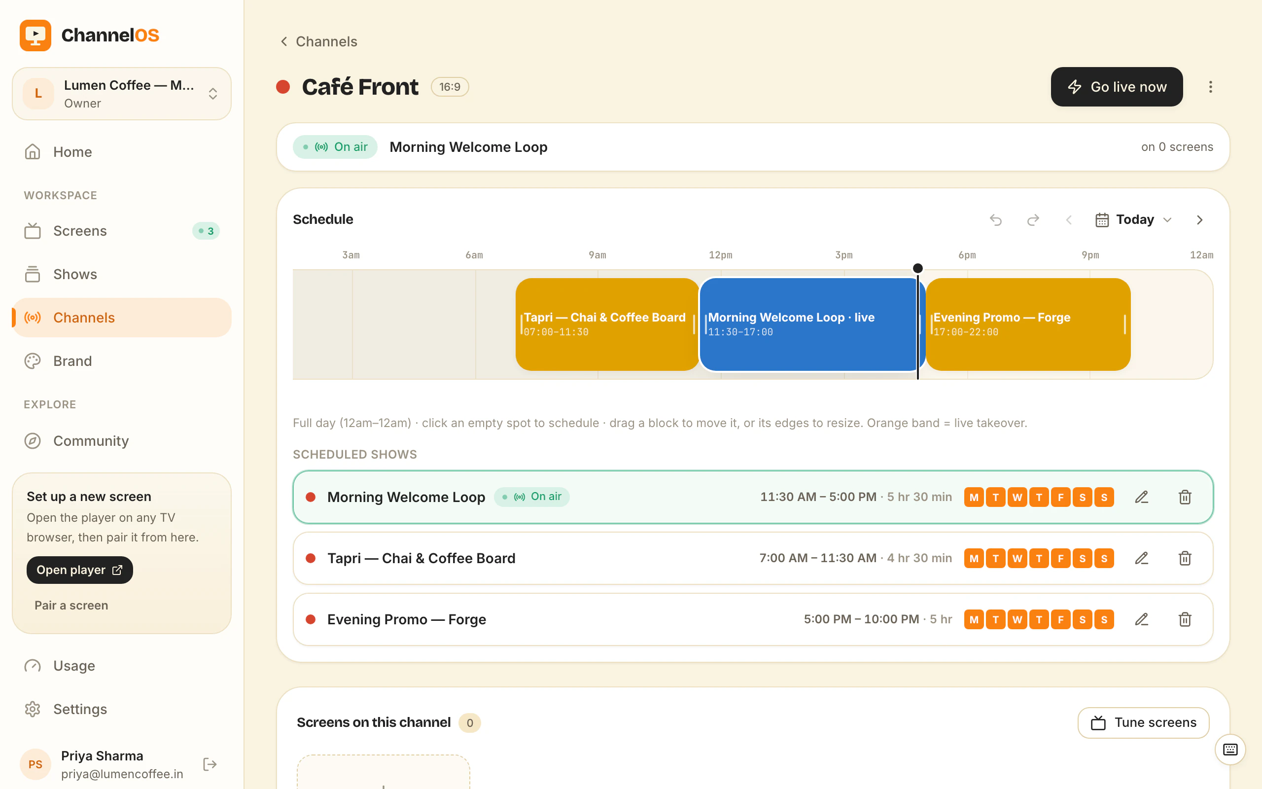
If the loop runs long, the answer is almost never faster transitions. It is dayparting: breakfast items need not share a loop with the dinner menu at 9am. Set the schedule once by hour and weekday and each screen runs the shorter, correct loop on its own clock — see digital menu board software and digital signage for restaurants.
Digital menu board design, as a checklist
Before a board goes on the wall:
- Furthest read measured, and the screen’s height in millimetres.
- Item names sized from the table above, not from how they look on the laptop.
- Everything important inside a 5 per cent margin on all four edges.
- Item text at 7:1 contrast or better, prices at 10:1, nothing under Medium weight.
- Five to seven items per panel, ten maximum, grouped under one heading.
- Prices right-aligned, tabular figures, decimals consistent, never larger than the item.
- One photograph per panel at 15 per cent of screen area or more, or none.
- Three colours, accent on one element.
- 10 to 12 seconds per panel, whole loop under 45 seconds.
- Then stand at the back of the queue and read it. That is the only test that counts.
The design work is finite, and most of it is settled the moment you measure the room. If you would rather correct a finished board than start from a blank canvas, open the menu board maker — its type sizes and item counts are already inside these limits. The first screen is free forever; prices after that are on the pricing page.
Frequently asked questions
- What size should the text be on a digital menu board?
- Work back from the furthest person who has to read it. The sign trade's rule is roughly 25mm of capital-letter height for every 3 metres of viewing distance, or about 8mm per metre. Capital height is around 70 per cent of the font size you type, so on a 55-inch 1080p screen an item name wants to be about 56px at 3 metres, 75px at 4 metres and 115px at 6 metres. On a 43-inch screen at the same distances, add roughly a quarter to each of those numbers, because the physical letters are smaller for the same pixel size.
- How many items should be on a digital menu board?
- Five to seven per panel, and ten as an absolute ceiling. The arithmetic decides it: once type is large enough to read from the back of the queue, a 1080-line screen with sensible margins and a section heading has room for about seven lines at 3 metres and about five at 6 metres. A printed board has to carry the whole menu because there is only one of it. A digital board does not — split the menu across several panels by course and let the schedule rotate them.
- What contrast ratio does a digital menu board need?
- At least 7:1 for item names and 10:1 for prices. The familiar 4.5:1 figure comes from web accessibility guidance written for a screen about 60cm from your face, and it does not hold for a wall-mounted TV read at 4 metres in a room with windows. Near-white on near-black — for example #F2F2F2 on #141414 — gives about 16:1 and has margin to spare. The mid grey many people use for secondary text, #888888 on a dark background, is only about 5.2:1 and disappears at distance, as does pure red on black at about 5.25:1.
- What is the best font for a digital menu board?
- A plain sans-serif at Medium or Semibold weight, with lining tabular figures so digits line up in the price column. Avoid anything Light or Thin, because strokes thin out with distance and with the aggressive sharpening most shop TVs apply. Avoid condensed faces for item names read beyond about 4 metres, and avoid script and handwriting faces for anything a customer has to read rather than admire. One typeface with two or three weights beats three typefaces.
- How should prices be laid out on a digital menu board?
- Right-align them in their own column so the digits stack, and use tabular figures so a 1 takes the same width as an 8. Never centre a price list. Keep the price the same size as the item name or one step smaller, never larger, because people scan for the dish first. Be consistent about trailing decimals across the whole board rather than mixing 12 and 12.00. Items with two sizes belong in a two-column table, not squeezed into the item name.
- How long should each digital menu board slide stay on screen?
- Budget about two seconds for someone to notice the board changed, plus a little over a second per line they need to read. A seven-item panel therefore wants 10 to 12 seconds; a single promotional slide with one headline wants 6 to 8. Keep the whole loop under about 45 seconds, so a customer waiting 90 seconds in a queue sees every panel at least twice.
Your screen is two minutes away.
Open the player on a TV, scan the code, publish a show. Your first screen is free.
Free screens show a ChannelOS banner along the bottom of the screen, and any paid plan removes it.