Build a show that is actually designed for a portrait screen
The mount is right, the rotation is right, and the board still looks like a mistake. That is because a 9:16 board is a column of type read top to bottom, and a disappointing portrait board is usually a wide layout that was turned on its side rather than composed for the shape.
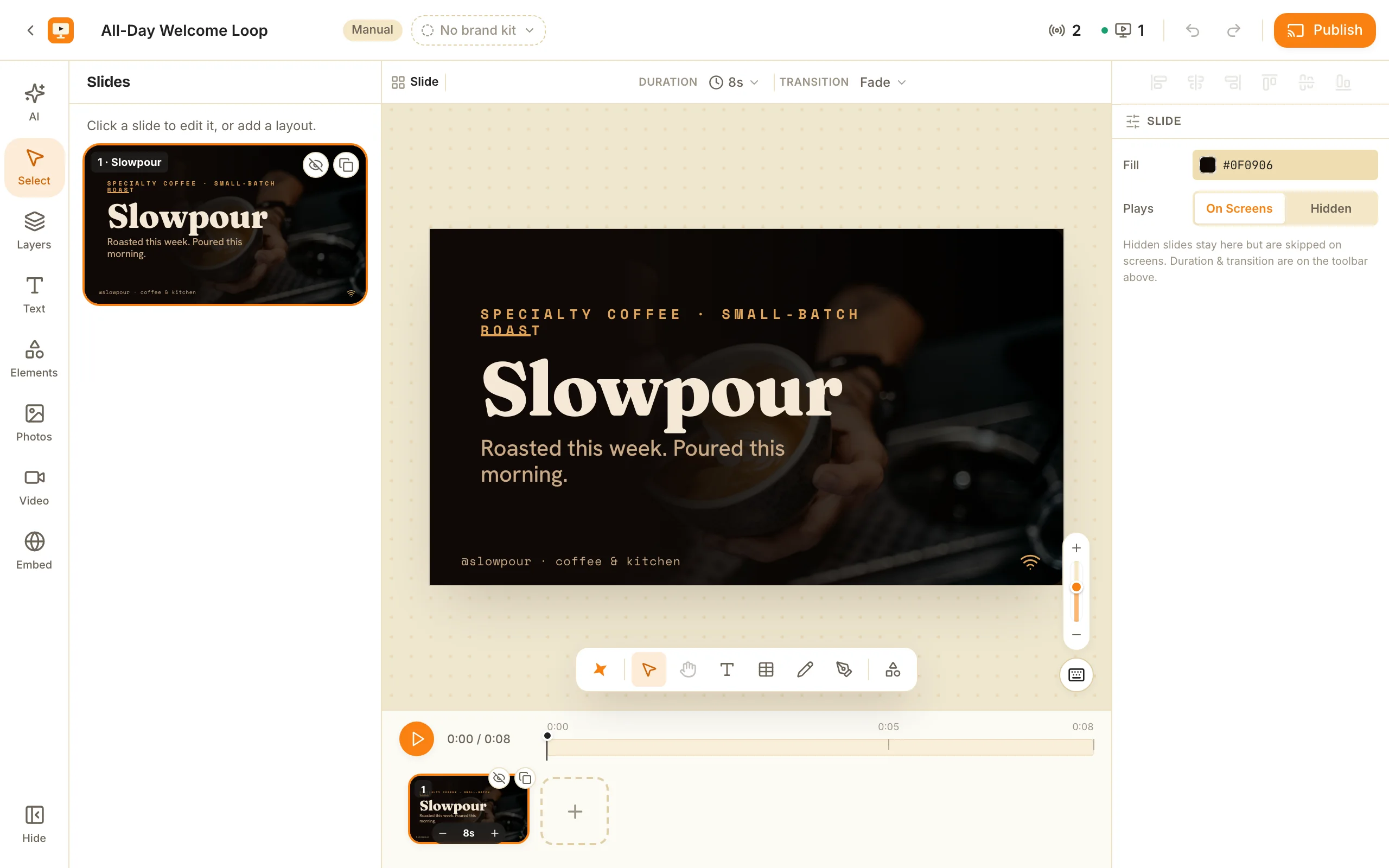
The short version, in 5 steps
- Create the show with New show, and on the empty board answer Shape of this show with Portrait, then Start building.
- Put the one line you most want read in the top third of the slide, where it sits at eye height.
- Set the type bigger than the number you would use on a landscape board, roughly 1.8 times, because the column is narrow.
- Replace any landscape photograph with a tall crop, a flat colour, or a cut-out product with no background.
- Keep everything readable inside the middle 90% of the slide, and put a QR code low, at thumb height.
The bracket held, the set is hung sideways, and the rotation is set correctly, so the board is the right way up. It still looks like a mistake. Everything sits in a strip across the middle with empty space above and below it, the headline is smaller than it was on the landscape version, and the prices have ended up as a column of small type near the floor.
Nothing is broken. The board was composed for a different shape and then turned.
A 9:16 board is a column of type read top to bottom, not a rotated poster. The reason a turn alone never gets you there is that the two halves of a slide convert differently. Positions are percentages of each axis, so a box at 10% across and 20% down stays there whatever shape the frame is. Type sizes are a percentage of the slide’s width, so they do not follow. Turn the frame and the layout survives while the proportions do not, which is why a three-column landscape layout becomes three slivers with every item name wrapping onto two lines.
That changes four things: where the important line goes, how big the type is, what you put behind it, and when you choose the shape.
What size should a portrait digital sign be?
9:16, which is 1080 by 1920 on an ordinary 1080p television. The resolution arithmetic and the safe-area margin are in portrait digital signage, end to end, the first lesson in this track.
The number that matters here is a different one. Because sizes are a percentage of the slide’s width, and a portrait slide is 1080 wide where a landscape one is 1920, the same type number renders at about 56% of the size. A heading set at 9 on a landscape board needs to be about 16 on a portrait one to look the same on the glass. Miss that factor of roughly 1.8 and the type comes out a little over half the size you intended.
The type can be bigger than you are used to, and it should be. A narrow column holds fewer characters per line, so a size that would be absurd across 1920 pixels is comfortable across 1080. A portrait board has height to spend: spend it on size, not on more lines.
How do I build one from scratch?
The shape is asked at creation, on the empty board, before anything can be added to it.
- New show. The editor opens on an empty board asking Shape of this show, with two choices: Landscape (“A TV on a wall”) and Portrait (“A screen stood on its end”).
- Tap Portrait. The frame turns on its end behind the buttons, so you see the real proportions before committing. The first tap previews and nothing is saved yet.
- Start building. Until the shape is answered the tools stay disabled: this is the one moment the question is free to answer.
- Put the one line you most want read in the top third, then work down in the order you want it read.
- Set the type bigger than feels right, then stand where your customer stands and check it.
On the free plan you get 2 shows at 3 slides each, which is enough to find out whether the spot works.
Where does the line you want read actually go?
In the top third, because that is the part at eye height.
A portrait board stacks vertically, so position is reading order in a way it never is on a landscape slide. The eye starts at the top and stops when it has what it came for. The bottom is read last, if at all, and it is also the part most likely to be behind somebody’s head: the lower-third check in choosing the spot and the height is the reason to assume the bottom of the board is compromised before you design into it.
So the useful default is a three-band stack. The top third carries the one thing that has to land. The middle carries the detail, which is where a priced list belongs. The bottom third carries what survives being half-blocked: the logo, the hours, and a QR code at thumb height rather than above head height.
Why do my photos look cropped in portrait?
Because they are, and the odds are against you before you start.
A 16:9 photograph filling a 9:16 frame shows roughly a third of its width, and whatever the photographer composed for is usually in the two thirds you lost. The stock libraries are worse: there is far more landscape material than vertical, so the easiest photograph to find is the wrong shape.
That is a sourcing problem rather than a portrait problem, and the fixes are dull:
- A vertical photograph chosen as one, not a wide image cropped down.
- A flat colour, which costs nothing and never fights the type.
- A cut-out product with no background, which has no shape of its own to clash with the frame. Bring one that is already transparent: one-tap background removal starts on Solo.
- Nothing, behind large type. From four metres this usually wins.
Pexels photos and videos are built in and free on every plan, and they do not count against the free plan’s one custom image, so trying several vertical sources costs nothing.
You also do not have to start from a blank slide. The template library carries portrait boards alongside the landscape ones, and they are free to open and remix.
Can I turn a landscape show I already have into portrait?
Yes, with one honest caveat about what you get back.
On /shows, a show’s menu carries Make a portrait version. It forks a second show rather than converting the one you have, so the landscape board you are already airing is untouched. The fork rescales the type, re-places the boxes into a vertical stack, and separates anything that ends up overlapping.
What comes back is a draft you finish: the pass gets you a readable starting point and leaves you the composition. Expect to cut lines rather than move them, because a reflowed board usually needs fewer items at larger sizes.
If the show is new and nearly empty, do not fork it. Answer the shape question at creation and skip the exercise.
When this is the wrong answer
Three cases.
One deck cannot fill both shapes. ChannelOS does not swap in a shape-matched layout per screen, so a mixed fleet means building the portrait boards separately. If every board must fill every panel automatically, buy a platform built around per-screen layout variants.
The content is a table. A tenant directory, a two-column timetable, a price list with four columns: these need line length, and a portrait board does not have it. Hang that one the normal way up.
The power gets switched off where the screen lives. A playing screen keeps playing if the wifi drops, and it keeps the show’s pictures and clips in the browser’s own storage so they are not re-downloaded every loop. It still needs the connection back to start again after a power cut, because the page and the show are fetched fresh each time. If a window board has to come back on its own through a long outage, a vendor who sells a media player with local storage is the better answer, and that is a real reason to buy hardware.
Build the first one at the right shape
Open a new show, answer Shape of this show with Portrait, and put one line in the top third at a size that looks too big. That is ten minutes, and it tells you more than any amount of planning in landscape.
The first screen is free for ever, with one thing to know before it goes in a window: a free screen carries a ChannelOS banner along the bottom, and about every two minutes that banner opens into a full ChannelOS slide for roughly 30 seconds naming what ChannelOS is and the channelos.tv address, then folds back. Any paid plan removes both. If your board comes up the wrong way round when it reaches the glass, which of the four settings is wrong is the next lesson.
Frequently asked questions
- Why is my text so small after I switched the show to portrait?
- Because a type size on a slide is a percentage of the slide's width, and a portrait slide is 1080 wide where a landscape one is 1920. The same number is about 56% of the size it was. If you flipped the show with Make a portrait version, the rescaling is done for you. If you built the portrait board by copying numbers across from a landscape one by eye, you undershot by nearly half, and the fix is to push every size up by roughly 1.8.
- How many items fit on a portrait menu board?
- Fewer than the shape suggests. A tall slide looks like it has room for a long list, but the item names still have to be large enough to read from where people stand. Treat three to five priced lines as a starting figure and test it on the real screen. The height goes on making those few lines bigger, not on adding more of them. If the menu is genuinely long, split it across slides or across two screens rather than shrinking the type.
- Should the logo go at the top or the bottom of a portrait board?
- The bottom, usually, and small. The top third of a portrait board is the part at eye height and the part a passer-by reads first, so spending it on a logo costs you the one position that sells something. Most wordmarks are also wide, which is the worst possible shape on a narrow slide: it either shrinks to nothing or has to stack onto two lines. Put the mark low, let the product lead.
- What do I put in the background if photographs do not work?
- Four things that suit a narrow frame. A deliberately tall crop of a photograph, chosen as a vertical image rather than cropped down from a wide one. A flat colour, which costs nothing and never fights the type. A cut-out product with no background, which has no shape of its own to clash with the frame. Or nothing at all behind large type, which on a board read from four metres is usually the strongest option.
- Where should a QR code go on a portrait screen?
- Low, at roughly the height of a hand holding a phone, and never in the top third. A portrait board is often hung so its top edge is above head height, and a code up there is physically awkward to point a camera at. Keep it on a light patch with clear space round it, and give it a line of text saying what scanning it does.
Further reading
Do it on a real screen.
Open the player on the TV, scan the code with your phone, and publish a show. Your first screen is free.
Free screens show a ChannelOS banner, and about every 2 minutes it opens into a full ChannelOS slide; any paid plan removes both.